NavigatorAgentic Search
The platform already held the answers. The design job was making an AI answer something a security leader would repeat to their board.
Result
Live
with customers, who now want it as the main way in
- RoleDesign Lead
- Timeline6 weeks, design to release
- WhenSep – Oct 2025
- Team5 disciplines
- UsersSecurity leaders (CISOs), security analysts
- PlatformResponsive web · in-product assistant
YouWhat are the critical findings affecting the Finance team right now?
Investigation
- UnderstandYou want what is critical right now for the Finance team, ranked by urgency.
- PlanSplit into 3 sub-tasks: find the assets, find their critical weaknesses, check the controls they affect.
- SearchFinance team assets: 3 found.
- Follow-upCritical weaknesses on those assets: 1 remote code execution on api.gateway. Followed it to the controls it touches.
- CorrelateCVE-2024-23113 is the reason PCI-DSS 6.3.3 is failing, so these are one problem, not two.
- ValidateAll 3 records refreshed within 4 minutes and none conflict.
There are 3 critical findings on Finance team assets. The highest priority is an unpatched remote code execution on — — which also causes control to fail.
Based on 3 sources · updated 4 min ago
Turn this investigation into an agent that repeats it for you.
Every morning, and when a new critical finding appears
- Search Finance team assets: 3 found.
- Follow-up Critical weaknesses on those assets: 1 remote code execution on api.gateway. Followed it to the controls it touches.
- Correlate CVE-2024-23113 is the reason PCI-DSS 6.3.3 is failing, so these are one problem, not two.
- Validate All 3 records refreshed within 4 minutes and none conflict.
Reads platform data only. Reports findings and drafts actions; a person approves before anything is sent.
Working recreation. Press L for the decision behind each part.Open “Design notes” in the footer for the decision behind each part.
NDA Interactive recreation with sample data. These are not production screens or customer data.
In 30 seconds
- 1
The problem
The platform held the answers to security questions, but nobody acts on an AI answer they can't check.
- 2
What I did
I designed how answers earn trust: sources next to every claim, a clear statement of what it can answer, a designed "I don't know", and no action without a person.
- 3
The outcome
Shipped in six weeks as an assistant panel. Customers now want it as the platform's main interface, and want to use it from their own AI tools too.
Jump toKey decisions Results
01The problem
An assistant that sits beside the work
Prevalent's platform connects everything a company knows about its security (devices, people, weaknesses, policies) from across all its tools. In the company's own words, security teams have "20 tools telling you 20 different stories". The platform turns them into one picture.
Navigator started as a shared ambition between me and one of our AI engineers: a way to simply ask that picture a question. We waited until the platform was ready, then proposed it together. Its shape came from a customer, who asked for a chat box on the right side of the product. That became the assistant: a side panel that sits next to the existing screens instead of replacing them.
The AI could already find the answer. Most of my time went into making everything behind the answer visible: where it came from, how it was found and why. Without that, nobody would act on it.
The PM and AI engineers owned how the data was handled. I owned how people read the answers and whether they trust them, working with one junior designer. Our designs shaped how the engineers improved the answers. First design to release took six weeks.
Constraints
- Only the platform's data
- The assistant answers from what the platform knows. Nothing from the open web, and no guessing.
- No action without a person
- The assistant can explain and recommend. Anything that changes something needs a person.
- Answers take a moment
- The experience had to hold up while an answer was still being put together.
- Security review
- An assistant answering questions about a customer's own security had to pass a security review before it shipped.
- Existing screens stay
- Navigator works alongside the dashboards, not instead of them. Every answer can open the full screen it came from.
- Six weeks
- From first design to release. Trustworthy first, broad later.
A confident wrong answer would cost more than no answer
Getting an answer meant knowing which screens to open, in which order, and how to read them together. Leaders relied on analysts to translate. An AI assistant was the obvious idea, and the obvious risk.
Prevalent's whole promise is trustworthy information. An assistant giving confident answers with no sources would break that promise inside the product itself. And a wrong answer repeated to a board would discredit the whole platform along with the assistant.
So I stopped asking whether the assistant could answer, and asked what an answer needs before someone will act on it.
The briefAdd a chatbot to the platform.
The brief, rewrittenShorten the path from a question to an answer someone can stand behind.
02Research
Leaders want the story, analysts want the specifics, and both want the evidence
Two things shaped the design: what the people asking need from an answer, and how the AI's answers actually go wrong.
How
- Interviews with a CISO and a security analyst
- One of each, both internal. How they get answers today, and what they need before acting on one or passing it up. A small sample, enough to see the two kinds of question but too small to validate the design.
- Reviewing how the AI gets it wrong
- With the AI engineers, sorted the ways answers go wrong (made-up facts, out-of-date information, sounding surer than it should) so each one could get its own designed state instead of being hidden.
What we learned
- 01
Two kinds of question
Leaders ask "so what?" and need a story they can repeat. Analysts ask "which one?" and "where?" and need specifics.
Which led to Answers that lead with a summary, then link to the details.
- 02
The evidence has to come with the answer
An answer that will be repeated to a board is only as good as its sources.
Which led to Sources shown right next to each claim, not hidden in a footnote.
- 03
A blank box is a wall
People who weren't experts didn't know what to ask and stalled at the empty input.
Which led to Suggested questions and follow-ups.
- 04
Confidently wrong is worse than unsure
One smooth, wrong answer damages trust in the whole platform.
Which led to A clear "I can't answer that" that points to what it can answer.
03Approach
Principles for this product
- Sourced or silent
- If an answer can't be traced back to the platform's data, the assistant says so instead of filling the gap.
- Guide, don't leave blank
- Suggestions beat an empty box for people under time pressure.
- Explain and recommend, never act
- The assistant explains and suggests. Doing more has to be earned.
I spent the time on one answer
The instinct on an assistant project is to design a chat window. I kept the chat itself minimal and spent the iterations on a single answer: where sources sit, how confidence is worded, which follow-ups appear, and how an answer opens into the full screen.
Before any screens, product, AI and I agreed what every answer must contain: a summary, its evidence, what it covers, and a next step. That made later decisions fast: any version missing one of the four was out.
Sketches
Redrawn for this portfolio. The original work is under NDA.
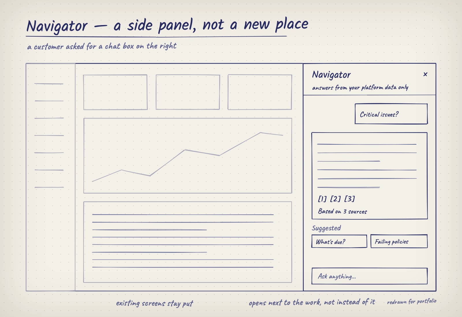
A customer asked for a chat box on the right. Navigator opens next to the work, not instead of it. 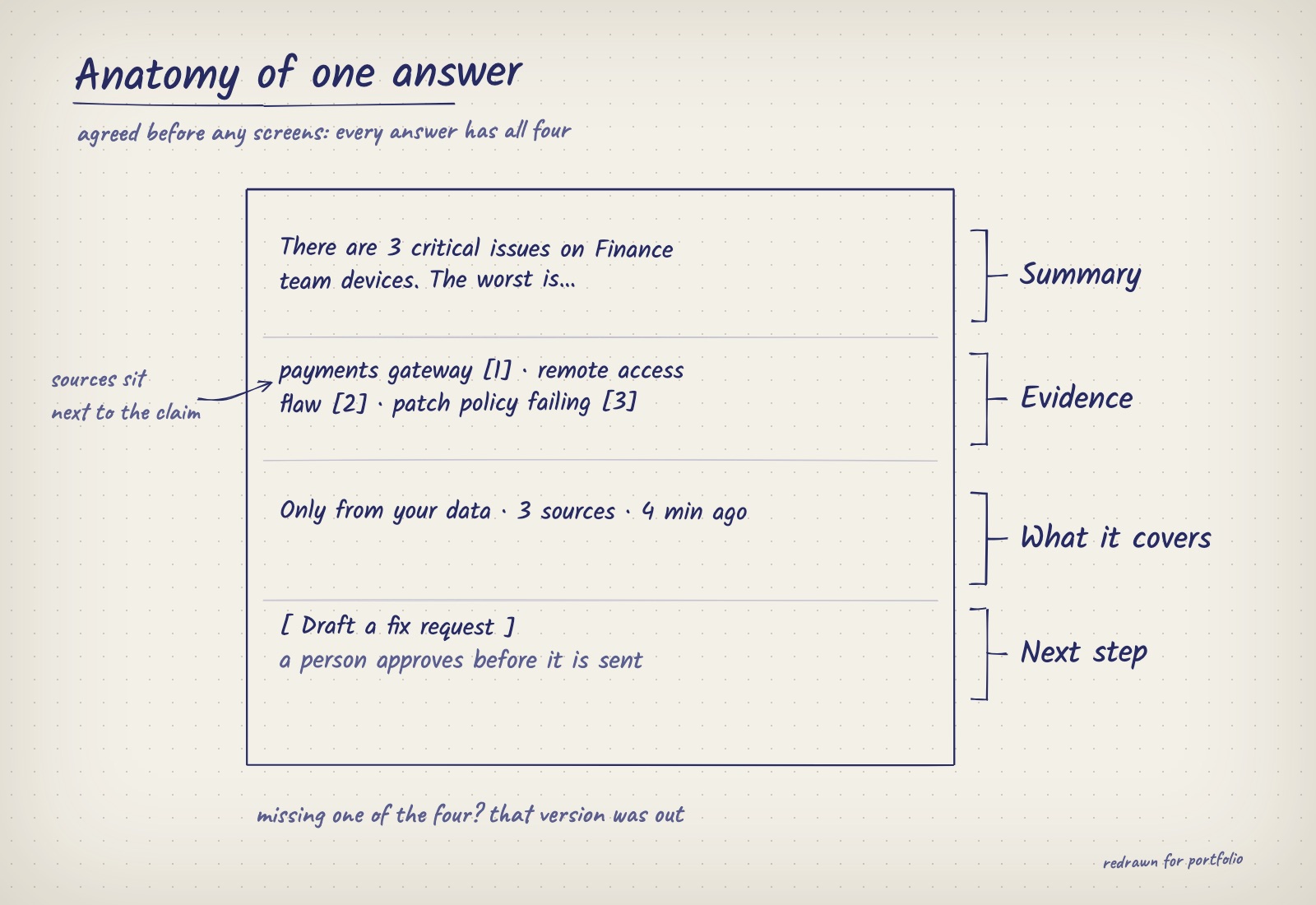
The anatomy of one answer, agreed before any screens. A version missing any of the four was out.
04Decisions
Decision 01Only answer from the platform's dataWhat I chose Navigator answers only from what the platform knows, and says what it can't answer.
- What I turned down
- A general assistant that also uses information from the web.
- Why
- Mixing sources makes it unclear where an answer came from. In a high-stakes product, a narrower assistant you can always check beats a broader one that's sometimes guessing.
- What it cost
- Some reasonable questions get "I can't answer that" instead of a helpful general answer.
Decision 02Sources shown by defaultWhat I chose Every claim links to where it came from, and hovering a source highlights it in a live view of the connected data.
- What I turned down
- A "show sources" button tucked under each answer.
- Why
- Evidence you have to ask for is evidence people skip.
- What it cost
- Answers are shorter, because nothing goes out without a source.
Decision 03Suggestions over a blank boxWhat I chose Suggested questions and follow-ups, with free typing always available.
- What I turned down
- An empty input with example text.
- Why
- Suggestions help people who aren't experts without slowing down the ones who are.
- What it cost
- Suggestions steer people towards what the assistant does well, which can hide its gaps.
Decision 04The assistant never acts on its ownWhat I chose The assistant explains and recommends; any action is prepared for a person to approve.
- What I turned down
- One-click fixes triggered straight from the chat.
- Why
- A wrong automatic action in security costs more than a slower human decision.
- What it cost
- Leaves real time savings on the table at launch.
Trust is part of every answer
- User needs & defining success
Success meant trustworthy before fluent
A good answer was one someone could repeat and stand behind, with a summary, evidence, what it covers and a next step. Better to say less with sources than more without.
- Mental models
It says what it covers before you ask
The assistant states what it can answer up front, so people set expectations before asking, not after a bad answer. Every answer opens into screens people already know.
- Explainability & trust
Sources are part of the answer
Sources sit next to the claim they support, and hovering one highlights it in the connected view. Confidence is in words. "Based on 3 sources" says why to trust it, where a bare percentage feels more precise than it is.
- Feedback & control
The assistant never acts
Anything actionable arrives as a draft for a person to approve. Suggestions guide, but free typing is always there.
- Errors & graceful failure
Every way of failing has a design
"I can't answer that" points to what the platform does know, so it is never a dead end. Each way the AI can go wrong got its own designed state instead of being hidden behind a smooth answer.
- Data & evaluation
Designed from how the AI really fails
With the AI engineers, I reviewed how answers actually went wrong and grouped them. Those groups became the brief for the error states.
Grouped by the themes of Google’s People + AI Guidebook.
Deliberately left out
- Acting on its own
- Held until explaining and recommending has proven reliable.
- Open-ended chat
- Conversation beyond the platform's data invites confident answers nobody can check.
- Answers without sources
- Nothing goes out without a source, even when that makes answers shorter.
How much the AI is allowed to do
- ExplainAnswers with sourcesShipped
- RecommendSuggests next stepsShipped
- AssistDrafts actions for approvalNext, gated on trust
- ExecuteActs with confirmationNot planned yet
- AutonomousActs on its ownNot planned yet
Deliberately set at explain and recommend. It moves further only as trust is earned.
05Testing
The failure states took more work than the happy path
The happy path, a sourced answer, settled early. The "I can't answer that" and partial-answer states took more rounds, and they mattered more for trust. A refusal that feels like a dead end teaches people the assistant is useless; one that points somewhere useful keeps them asking.
Designing those states first is the main thing I'd carry into any AI product: the way a system fails decides whether people believe it when it succeeds.
06Results
Shipped as a side panel. Customers want it as the front door
- 6 wksDesign to release
From first design to a shipped assistant, with a junior designer and a cross-functional team.
- LiveWith customers
In use as an assistant panel next to the existing screens.
- Side panel → main way inWhat customers ask for
Many customers now want Navigator as the platform's main interface, not a side panel.
- Their own AI toolsAlso requested
Customers want the same sourced answers inside the AI tools they already use.
What I’d measure next
I don't have usage numbers I can share. The demand above is what customers have asked for; these are the signals I'd use to measure it.
- How often people open sources
- Which sources people check shows where trust is thin.
- Questions it can't answer
- A ready-made list of what to build next.
- Time from question to action
- Compared with finding the answer through the dashboards.
- Answers shared onward
- The real test of an answer people trust.
What I'd keep, and what comes next
- Limits made it better
- Answering only from the platform's data felt limiting, but it's the reason every answer could show its source.
- Design the failure states first
- The "I can't answer that" and partial answers took more work than the happy path, and did more for trust.
- Track trust from day one
- I'd track which sources people open from launch. It's the clearest sign of where trust is thin.
- Next: from side panel to front door
- If Navigator becomes the main way in, and works inside customers' own AI tools, the sources and limits have to travel with every answer, wherever it shows up.
- Next: one step further, with approval
- Prepare fix requests for a person to approve, and track how often people edit them before sending.
- Next: feedback that fixes the data
- Replace thumbs up / down with "this is wrong because…", tied to the source, so feedback fixes the data as well as the AI.